Not exactly the greatest comeback since Lazarus (left), but I think people were finding the information useful. Therefore, I’m rehosting the site on another space, to keep the articles online.
Anyway, I’m not working in print publishing at the moment and it’s a bit difficult to keep writing QuarkXPress tips as I no longer have access to a copy. So, if anyone would like to contribute to the site, please leave a comment and I’ll see about adding you to the author list (I’ll be able to see your email address, although it won’t be displayed). It would be great to have some tips on QuarkXPress 8, InDesign and Word 2007 (assuming they’ve put any useful features in it).
]]>For reasons that have long escaped me, QuarkXPress has no automatic method for making bullet points (or numbered lists for that matter). There’s no magic button, as in MS Word, that gives you an instantly formatted bullet point that’s easy to customise.
If you’re importing text from MS Word (Word 2003 at least) using File>Import Text, your bullet points will disappear. The way I get around this is to follow the steps outlined on this post and this one. This also assumes your MS Word document is built on styles and you have set one up for bulleted lists.
Once your text is in QuarkXPress, you can then change the bullet character using Find/Change and deselecting the Ignore Attributes box — this allows you to change the font, colour and character. Because I produce mostly text-based publications I’m quite conservative with bullets, using solid squares and circles, but it’s a matter of personal choice.
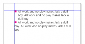
There are essentially two ways to format bulleted lists; with a hanging indent and without. Again, it’s a matter of personal taste — hanging indents (the first example) look more distinct in my opinion, but if you’re typesetting to very narrow columns, non-hanging indents might be more appropriate.
To make the hanging indent, as in the first bullet point, edit your style and go to the format box. In the Left Indent box, enter a positive measurement; in the First Line box, enter an identical negative measurement. In this example, I used values of 5mm and -5mm.
For the non-hanging indent, you simply have to enter a single figure in the Tabs box (again, 5mm).
I still find this non-intuitive, but the method is simply to double the value of the Left Indent. If I needed a subordinate bullet for the hanging indent on this example, I would use a value of 10mm for the Left Indent and -5mm for the First Line.
There is an alternative to the method described above, which might be useful if you’re doing your composition in QuarkXPress rather than MS Word:
It is possible to use an image as a bullet point. The basic principle is to draw a (small) picture box on the pasteboard with the object tool and then import an image into it. Press copy (or cut), switch to the content tool and then paste it into the text. You will have to experiment with the size of the picture box so as not to affect the line spacing.
Although this doesn’t seem to work on all versions and platforms, for a single Zapf Dingbat character (if you have it installed), press Ctrl-Shift-Z (or Cmd-Shift-Z on a Mac) then type a character. For a Symbol character, press Ctrl-Shift-Q (Cmd-Shift-Q).
]]>Word 2003 produces some pretty horrible code too and less web functionality – I’m informed that Word 2007 has improved this somewhat, but still has some way to go. (If you have experience of Word 2007 and Quark, please leave a comment on this page.)
Here’s an illustration. Open up Notepad (or similar) and type the following:
<p>Hello</p>
Select ‘Save As’ then type ‘file.htm’ into the filename box, which will produce an HTML file with the icon of your default browser. Double-click the file to view the results. As a comparison, open up MS Word, type in ‘Hello’ and save as a webpage. Then open up the file in Notepad to see the code. You’ll agree that it’s awful and there’s a lot of it. (QuarkXPress is no better.)
The straightforward way to publish online is to make a web-optimised PDF, but there are also good reasons to do it in HTML. There are proprietary tools that will produce nice code for you, but buying such a product might not be an option.
What I’m going to describe is tricky and a bit of a work-in-progress. It’s not an elegant solution, but it works okay and will hopefully save you some time. It’s a better alternative than making a text-only file and then formatting paragraph by paragraph.
The main reason is Cascading Style Sheets (CSS). Like the style functions in Word and Quark, they remove the need for manual formatting and keep the content and formatting separate. Without formatting to worry about, all you mostly need to do is produce bog-standard HTML (with perhaps some additional styles created by whoever wrote the CSS). This is the whole principle on which WordPress and other blogging platforms are founded and the reason why we can change our page templates so easily.
Additional reasons to use standard code are accessibility and the desirability of keeping file sizes down.
This tutorial will essentially describe how to convert a long text-string from Quark into HTML. It is likely that you’ll still need to go into the code to fix some glitches and you’ll have to add any images, tables and suchlike manually. It’s a bit of a hack solution, but it has worked for me. As always, if you have any suggestions, please email me or leave a comment.
The structure of HTML is essentially similar to any large document. In a book, you’ll have a visual hierarchy of styles where, for example, a chapter heading is superior to a main heading, which is in turn superior to a subheading. Likewise in HTML there are headings <h1> to <h6>. Likewise you’ll be using ordered (numbered) lists and unordered lists (bullet points), corresponding to <li> tags, which in turn are wrapped in the <ol> and <ul> tags respectively. Your body copy will correspond to the HTML paragraph style <p>. In a book or report, the chances are those tags and styles will correspond to the vast majority of your document. The trick is to produce plain text that is wrapped in these tags.
To guard against any residual fonts creeping into the HTML, convert all the text to 12pt Times New Roman. You can do either do this in the style sheets or by deleting fonts in the Usage box and replacing them with Times New Roman. Use find and replace to get rid of all the bullet points in the document. You’ll also need to get rid of all the numbers in numbered lists. (Of course, this assumes your bulleted lists and numbered lists are built using styles.)
Bear in mind the aim is to produce HTML — the CSS and the browser will do the formatting for you.
Save to Word using File>Save Text (if you’re unsure how to do this, it’s on the same principle as the method discussed here). Your Quark styles will follow through into the Word version
Open up your new word file. In Word, Format>Styles and Formatting will display the styles. Now, this is where it gets a bit tricky as Microsoft has generally overcomplicated this function and it’s a mess. You may have to go to the bottom of the Styles and Formatting pane and select Show: Custom, then display all styles.
The heading styles you’re looking for are Heading 1 to Heading 6, which correspond to <h1> to <h6> in HTML. By convention, Heading 1/<h1> is the title. Click on your main heading style, select ‘Select All’ on the drop-down menu, then apply Heading 2. Apply Heading 3 to the next style and so on.
For body text, you need to apply the style Normal (Web).
Bullets and numbers are tricky – try as I might, I couldn’t find a solution that produced the right tags. The solution is a hack – select the styles that apply to bullet and numbers and apply one of the near-redundant html styles on the list (I use HTML typewriter). You may want to apply others if you have well-used styles, although keep a note of what they are.
Saving as ‘Web page, filtered’ seems to produce better results than save as ‘Web page’. You can then open up your file in Notepad to do some more fixing.
<p class=MsoNormal><tt>Bullet point 1</tt></p>
You can fix this using find and replace. In this example, replace <p class=MsoNormal><tt> with <li> and change </tt></p> to </li>. These will all display as bullets in a browser. To make strict HTML, you’ll have to manually add <ul> and </ul> before and after these list tags to make proper bullets and <ol> and </ol> to make numbers.
What you’ll see won’t look that special – the text will take on the default characteristics of your browser – but hopefully the structure will be okay. If anything looks awry, you’ll have to go into the code and fix it. The most usual problem is font tags creeping into the HTML, which you don’t want. Other tags in your original file, such as ones for superscript, italic and so on may also have gone missing.
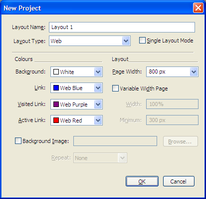
]]>When you go to File>New Project dialog box, there’s an unassuming orange Quark symbol at the bottom left. Clicking on this button brings up this dialog box.
(If you have an existing job open, you can also go to Layout>Layout Properties and change the Layout Type from Print to Web, although you might want to do this to a copy of your original.)
There aren’t too many options to worry about. Checking Single Layout Mode creates a project where the pages are all the same size. You can fix the width of the page in pixels or have a variable width that resizes with the browser window. There are some colour options and the ability to set a background image on the page.
As you’d expect, working in the Quark web layout is fairly similar to working in the print layout. There’s an additional tools palette, which contains tools for making buttons, forms, tick boxes and the like. However, as someone whose only real experience is creating static webpages, there’s no way of making the buttons or tickboxes do anything.
HTML is obviously much more limited in its formatting options than QuarkXPress and several features unsupported by HTML don’t work in the web layout, for example kerning and fine control over leading. On more elaborate layouts, Quark will solve issues such as wrapping text around an object by converting it into a graphic.
Simply go to File>Export>HTML and press OK. Pages will export as HTML files and all images will be stored in a separate folder called ‘images’. There’s no built-in FTP client and, at least in Windows, saving to ‘My Network Places’ doesn’t seem to work. Therefore you’ll need to save to your hard drive and upload using an FTP client — I personally use the free FireFTP plug-in for the Firefox browser.
It’s not necessary to downsample your images, as the export feature will produce new web-optimised images for you.
Cascading style sheets (CSS) are to the web what the Style Sheets function is to Quark. They separate the formatting from the content and are therefore very powerful. All websites worth their salt use CSS; however, unlike Quark Style Sheets, they’re responsible for a lot more than just text and essentially control the entire look of a website.
Quark does include a limited amount of CSS support, but this seems to be restricted only to text. Of course you can make global changes to your site by editing the Quark Style Sheets, but for many features you’ll have to edit pages manually, which is very time consuming.
I created an online CV using QuarkXPress — I’ll keep some anonymity by not linking to it, but the layout and structure are similar to this online resumé.
I created the basic layout — the header, footer and left-hand navigation panel — on a Quark master page and used the two-button rollover feature to create the effect on the left-hand panel. Each document page in Quark corresponded to a single HTML file. Here’s my verdict:
I’ve been a bit negative regarding this feature, but then I know some HTML and CSS and have some knowledge of the web in general.
However, if you’re called upon to make a straightforward, static website that doesn’t have that many pages — and you have QuarkXPress already — then this is a decent option, if you can cope with the large file sizes and lack of accessibility features.
The best resource for this is probably the QuarkXPress forums.
]]>How much bleed depends on your printer — typically they request 3mm or 5mm. It’s a good idea to check this before you start your project as it saves time later.
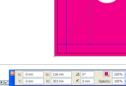
Here’s a screengrab of a coloured area at the left-hand edge of an A4 landscape page. The black edge is the page edge and you’ll see that the magenta box is overlapping (bleeding) over each end.
This is easy to achieve using the control panel. To do 3mm of bleed overall, draw a picture box anywhere and set both the X and Y co-ordinates to -3mm. As the page is A4 (297x210mm), it needs to have 6mm added in both dimensions so it bleeds over all the edges. Therefore, the width and height measurements are set at 216mm and 303mm. If you need 5mm of bleed, the X and Y co-ordinates would both be -5mm and the size of the box would be 220x307mm.
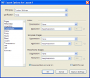
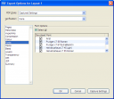
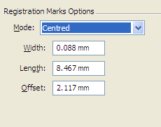
When you output the file using the method described on this page, you’ll be presented with the ‘Marks’ series of options. The good news is that, if you’re using standard bleeds of 3mm or 5mm, you generally don’t have to worry about changing the defaults — just select ‘Centred’ for the mode. (There’s also a mode called ‘Off-centred’, which I’ve never used — one day I’ll find out what it’s for.)
I’m mentioning this only because I once had to output a cover for a hardback book at a specialist printer, who requested 20mm of bleed. After a lot of fiddling about, I realised the essential principle is that the length of the marks must always exceed the bleed. The width of the marks and the offset (the distance between the edge of the image and the edge of the page) stay the same.
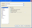
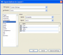
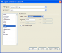
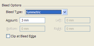
For a print job, in the Bleed options, you will nearly always want to select the ‘Symmetric’ type (i.e. the same on all four edges), then enter the amount of bleed in the box. Leave ‘Clip at Bleed Edge’ unchecked.
If you’re also doing a web version, however, you don’t want any crop marks and bleed. In this instance, turn off the crop marks in the Marks box, set the bleed amount to zero and select ‘Clip at Bleed Edge’.
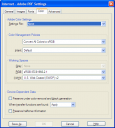
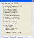
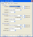
]]>I personally distill my PostScript files to a preset I set up myself called ‘internet’. It gives smaller file sizes than Distiller’s own preset ‘smallest file size’. I arrived at these settings through trial and error, but they work well for me. Click on the images below to start a slide-show. Again, if you’ve anything to add, please post a comment.
]]>I’m not the world’s best commentator, so you’ll have to forgive me. If you’re interested, the video was created using a very handy bit of software called CamStudio (from camstudio.org) and uploaded onto Veoh.com (whose quality appears to be better than YouTube’s). As always, comments are welcome.
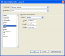
Here are some screen captures to show the options you may need to change when your making your PostScript file for PDFing. Click on the first image to start the slideshow and press ‘next’ to advance.
Note: As the commentary on crop marks was admittedly a bit sketchy, you may wish to read this post.
]]>This website has a pretty comprehensive list of Quark shortcuts for PC and Mac. John Brandt has produced a PDF containing a very extensive list of shortcuts, which can be downloaded from Planet Quark‘s website [link].
Increase font size through preset steps | Ctrl-Shift-. |
Increase font size through 1pt steps | Ctrl-Alt-Shift-. |
Decrease font size through preset steps | Ctrl-Shift-, |
Decrease font size through 1pt steps | Ctrl-Alt-Shift-, |
Increase leading through 1pt steps | Ctrl-Shift-‘ |
Increase leading through 0.1pt steps | Ctrl-Alt-Shift-‘ |
Decrease leading through 1pt steps | Ctrl-Shift-; |
Decrease leading through 0.1pt steps | Ctrl-Alt-Shift-; |
Useful when you are one word over on a column and you need to lose a line. Don’t overdo it though.
Increase in 10/200-em steps | Ctrl-Shift-] |
Increase in 1/200-em steps | Ctrl-Alt-Shift-] |
Decrease in 10/200-em steps | Ctrl-Shift-[ |
Decrease in 1/200-em steps | Ctrl-Alt-Shift-[ |
Centre image in a picture box | Ctrl-Shift-m |
Fit image to box (keeping aspect ratio) | Ctrl-Alt-Shift-f |
Ctrl-0 (zero) is very useful, fitting the page to the size of the screen. If you have a wheel on your mouse, you can increase or decrease the size of the page by pressing Ctrl and turning the wheel forward and backward. Otherwise, press Ctrl-Space and draw a marquee to enlarge a specific area.
A non-breaking space can be very useful; for example, if your style sheet specifies measurements should have a space preceding them (such as 5 ml or 35 g) and you don’t want them to break at the end of a line. This is achieved by typing Ctrl-5. Similarly, a non-breaking hyphen can be inserted by using Ctrl-=.
Typographically, a slash (/) should be preceded and followed by a thin space, which you can get by pressing Ctrl-Shift-8. (It’s a bit anal, but it does look nicer.)
When you’re inserting automatic page numbers on a master page the shortcut, when you’re inside a text box, is Ctrl-3.
And you all know that you should press Shift-Enter to start a new line, as opposed to Enter, which starts a new paragraph!
]]>If you place the cursor inside a text box and go to File>Save Text, QuarkXPress will let you save the entire story — the contents of the text box and all those linked to it. If you select some text additional options will appear; either to save the selected text or the entire story.
You are presented with a number of options in the ‘Save as Type’ drop-down menu, although you will presumably want to save to the most up-to-date version of Microsoft Word.
There are sometimes good reasons to do this — if authors decide to do a substantial rewrite, or wish to update a previous version of a publication, it makes sense to let them edit the text directly. Of course, this may only be a good thing if your publication is essentially a single, long text thread. You may wish to sit down with authors and explain how the formatting works, to avoid having to tidy up their text too much at a later stage.
Depressingly, the other reason you get asked is because some people assume there’s some magic feature that transforms a Quark document into a faithful Word version (or that you’ve managed to do it in Word in the first place). And there obviously isn’t. Any independent elements such as manual footnotes, tables, standalone text boxes and images will not export.
Actually, Find and Replace is one of the better features of MS Word. I consider myself pretty decent on it, but there’s far more functions in the Help screens than I ever use. The important thing to bear in mind is that you can find and replace things far beyond letters, numbers and words. In addition, I would recommend doing all your finding and replacing in Word as, in terms of working on copy, the functions are more powerful than the equivalent ones in Quark.
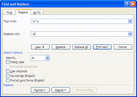
Anyway, here’s the box. The full functions are revealed when you press the ‘more’ button.
The non-keyboard elements you can search for are all located in the ‘special’ button and enter search terms in the relevant box, usually in the form of the ‘^’ symbol followed by a single letter. For example, ‘^p’ is the term for a paragraph mark (i.e a carriage return).
There are three find and replace functions I do on any new document. I actually have macros set up to do these on individual buttons on my toolbar. How to do macros is a bit beyond the scope of this post, but this guide on about.com is pretty good.
Sometimes — usually the result of putting text through too many clipboard functions or converting formats too many times — you get a Word document where every line ends in a carriage return. Namely, when you show the hidden formatting, it looks like this:
This would obviously play havoc with formatting and I expect many people have been reduced to fixing this line-by-line. The good news is that there’s a straightforward fix for this. The approach is an example of the lateral thinking you sometimes need when faced with similar problems.
Okay here’s the fix. From looking at the copy, each paragraph proper is separated by two paragraph marks (the invisible ¶ symbols). Firstly, I’d recommend running the three find and replaces explained above.
As we’ve seen, these non-printing characters are searchable. Selecting the paragraph mark option twice from the ‘special’ menu will give you the codes ‘^p^p’ in the find box. You then need to replace this with a character (any character) that you’re confident doesn’t appear in the document. I usually use the dollar symbol, although US and Australian readers may wish to use something else. When you press replace, everything may turn a bit scary, but don’t worry.
You can then replace every single paragraph mark with a space. Once you’ve done that, change the new character you’ve introduced back into a paragraph mark (I recommend using a single paragraph mark, as paragraphs should really be separated by setting a distance in the paragraph formatting box). And there you go. So, to summarise:
Try this out yourself to experiment — you’ll soon get the idea.
]]>