Some font tweaks
The usage dialog box (Utilities>Usage) is a very useful thing and worth getting acquainted with.
Here’s a typical usage dialog box for one of my projects, after selecting fonts on the left-hand pane.
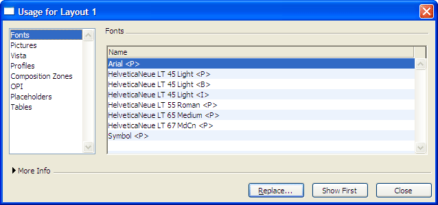
Looking at this, there are two things that need fixing:
- On a document based on Helvetica Neu, some Arial has crept in to the document, almost certainly from the imported Word file. Clicking ‘replace’ gives you the option of changing it to your favoured font. You may wish to select ‘show first’, which shows you where it is before you do this (the button has fallen off the page in the graphic above). It’s often something very small, such as a stray paragraph mark or single paragraph. Times New Roman has a habit of creeping into Quark files as well, usually on the superscript numbers that link to footnotes.
- You’ll notice one of the fonts is HelveticaNeue LT 45 Light <B>. As I explained on this post, this isn’t a true bold font and will ring alarm bells when you see it on your final proofs. In this case I would replace this with HelveticaNeue LT 55 Roman <P>, a heavier font I’m using for bold text.
(On a Mac, fonts display a little differently, but the principle still holds.)
Leave a Reply